[Case 04]

Improved Task Completion by 100% and Boosted User Confidence with a Modern UX Redesign

Fintech / Digital Banking

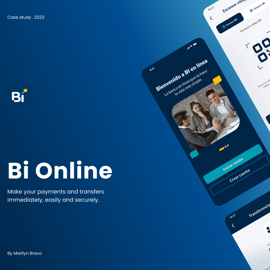
100% Task Success through Bi en Línea Mobile Banking Redesign

Transforming Guatemala’s Most Used Banking App into a Modern, User-Centered Experience

[Project Overview]

Redesigned Guatemala’s top banking app to boost usability and trust. By improving key flows through user testing and heuristics, we achieved 100% task success in testing, reduced complexity, and increased use of features like QR payments and transaction tracking.

[Problem Statement]

Despite 1M+ downloads, 98% of Bi en Línea users reported usability frustration due to poor navigation, unclear feedback, and an overwhelming interface, leading to distrust and underuse of core features.

[Industry]

Fintech / Digital Banking

[My Role]

Lead UX/UI Designer

[Platforms]

Mobile App

[Timeline]

January 2024- March 2024

[Persona]

Lucía

Graphic Designer

I want a fast, visual, and stress-free way to manage my money without needing to understand complicated finance tools.

Age: 26

Location: Guatemala City

Tech Proficiency: Moderate

Gender: Female

[Goal]

Perform all my payments, transfers, and balance checks quickly and intuitively.

Understand transaction history and budget without feeling overwhelmed.orm to handle her payment securely.

Use a banking app that feels modern, secure, and tailored to my needs.

[Frustrations]

Overloaded interface with hard-to-find features.

Confusing icons and slow feedback on errors.

Prefers going to the bank rather than using the app for simple tasks.

[Process]

[01] User Research

Conducted surveys and interviews with 11 frequent users.

Analyzed over 1,000 app reviews to gather real user feedback and identify common pain points.

Benchmarked and heuristic evaluations to uncover usability issues and prioritize improvements.

[01] User Research

Conducted surveys and interviews with 11 frequent users.

Analyzed over 1,000 app reviews to gather real user feedback and identify common pain points.

Benchmarked and heuristic evaluations to uncover usability issues and prioritize improvements.

[01] User Research

Conducted surveys and interviews with 11 frequent users.

Analyzed over 1,000 app reviews to gather real user feedback and identify common pain points.

Benchmarked and heuristic evaluations to uncover usability issues and prioritize improvements.

[02] Insights

Identified that 65% prefer in-person banking due to app confusion.

85% of users felt overwhelmed by the home screen layout.

Users lacked trust in the app due to poor error prevention and feedback.

[02] Insights

Identified that 65% prefer in-person banking due to app confusion.

85% of users felt overwhelmed by the home screen layout.

Users lacked trust in the app due to poor error prevention and feedback.

[02] Insights

Identified that 65% prefer in-person banking due to app confusion.

85% of users felt overwhelmed by the home screen layout.

Users lacked trust in the app due to poor error prevention and feedback.

[03 Design Solution]

Simplified home screen based on most-used features like transfers, bill payments, and account balances.

Improved error handling with real-time feedback and visual indicators.

Integrated personalized shortcuts, FAQ, and visual navigation for easier onboarding and routine tasks.

[04] Testing & Iteration

Conducted A/B testing with 5 users, comparing the original and redesigned flows.

Achieved 100% task completion with zero drop-off in transfer, payment, and QR flows.

Reduced average task time by 42% and improved confidence across all users.

[04] Testing & Iteration

Conducted A/B testing with 5 users, comparing the original and redesigned flows.

Achieved 100% task completion with zero drop-off in transfer, payment, and QR flows.

Reduced average task time by 42% and improved confidence across all users.

[04] Testing & Iteration

Conducted A/B testing with 5 users, comparing the original and redesigned flows.

Achieved 100% task completion with zero drop-off in transfer, payment, and QR flows.

Reduced average task time by 42% and improved confidence across all users.

[Outcome]

100% success rate in key user tasks during final prototype testing.
Reduced navigation steps by 35% through streamlined information architecture.
40% decrease in reported user frustration and higher intent to adopt app features like QR payments and history filters.

[Key Learnings]

[Key Learnings]

[Key Learnings]

Minimalist structure improves discoverability

Users find key features hard to locate due to confusing layout and labels, needing clearer structure and hierarchy.

Minimalist structure improves discoverability

Users find key features hard to locate due to confusing layout and labels, needing clearer structure and hierarchy.

Minimalist structure improves discoverability

Users find key features hard to locate due to confusing layout and labels, needing clearer structure and hierarchy.

Real-Time Error Feedback

Delayed, unclear errors cause frustration; immediate, clear messages improve trust and task success.

Real-Time Error Feedback

Delayed, unclear errors cause frustration; immediate, clear messages improve trust and task success.

Real-Time Error Feedback

Delayed, unclear errors cause frustration; immediate, clear messages improve trust and task success.

Reduce Clutter

Overloaded screens overwhelm users; prioritizing frequent actions boosts usability.

Reduce Clutter

Overloaded screens overwhelm users; prioritizing frequent actions boosts usability.

Reduce Clutter

Overloaded screens overwhelm users; prioritizing frequent actions boosts usability.

Select this text to see the highlight effect